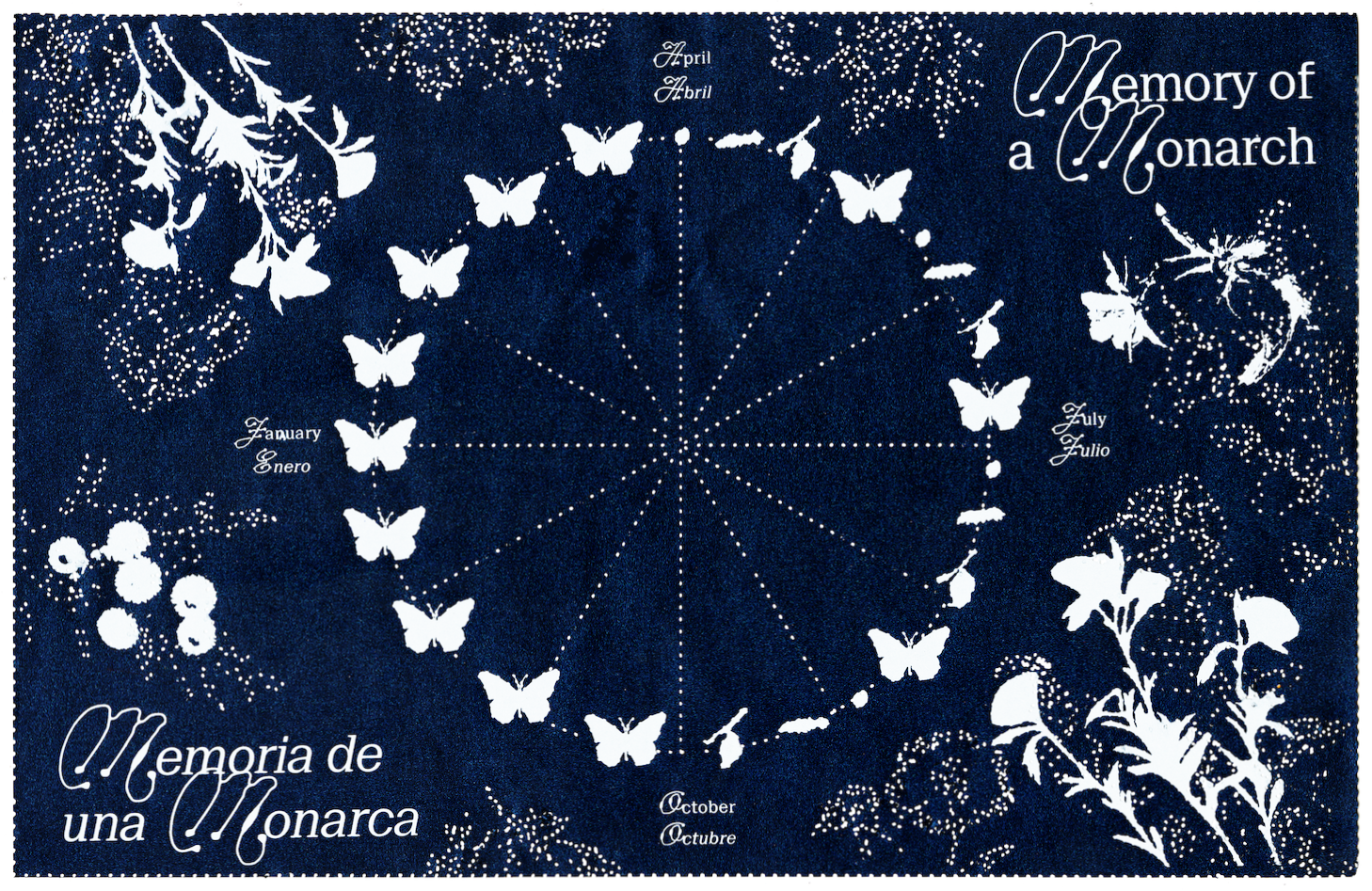
Designing a low-production zine that captures the beauty and cultural complexity of monarch migration.
Brief
Design a zine that can be printed in a multi-edition run about the monarch sanctuary in Mexico.
Early considerations
Jingdezhen is the birthplace of porcelain and has been a cultural capital for the ceramic arts for centuries. It is a cultural icon and source of national pride in China, and continues to be a powerhouse in the production of fine ceramic products to this day. This exhibition is a chance for ceramic artists from around the world to exhibit different ceramic arts techniques and philosophies, under the backdrop of a city steeped in history and legend.
The precedent set by previous iterations of the biennale left many things to be desired. While the biennale is sourced from a place of history and story and culture, the accompanying identity is generalistic.
As I set out to design an identity for the biennale, I wanted to capture the unique nature of the place and time that the biennale was being held, more so than the previous design.
Early Gestures and Concepts
In sketching, I explored a variety of gestural concepts that could correlate and respond to the themes I identified in my early research.
Morphing type to the shape of ceramics captures the energy and dynamicism of the history of ceramics, but ultimately felt too edgy and didn't pair well with Chinese characters.
A bisecting line at the angle of the traditional dragon kilns used to fire porcelain pulled inspiration from the making of ceramics, but struggled in oversimplifying the themes of the biennale.
Moving forward, I pulled inspiration from the first concept and centered the design system around a library of individual ceramic assets which aim to capture the diversity of work in the biennale by representing ceramics in a variety of shapes and sizes. These assets are abstracted and distant from reality, as to not impose any narrative upon the work shown, which are often far more speculative and structural than functional.