


-
● Studio Project
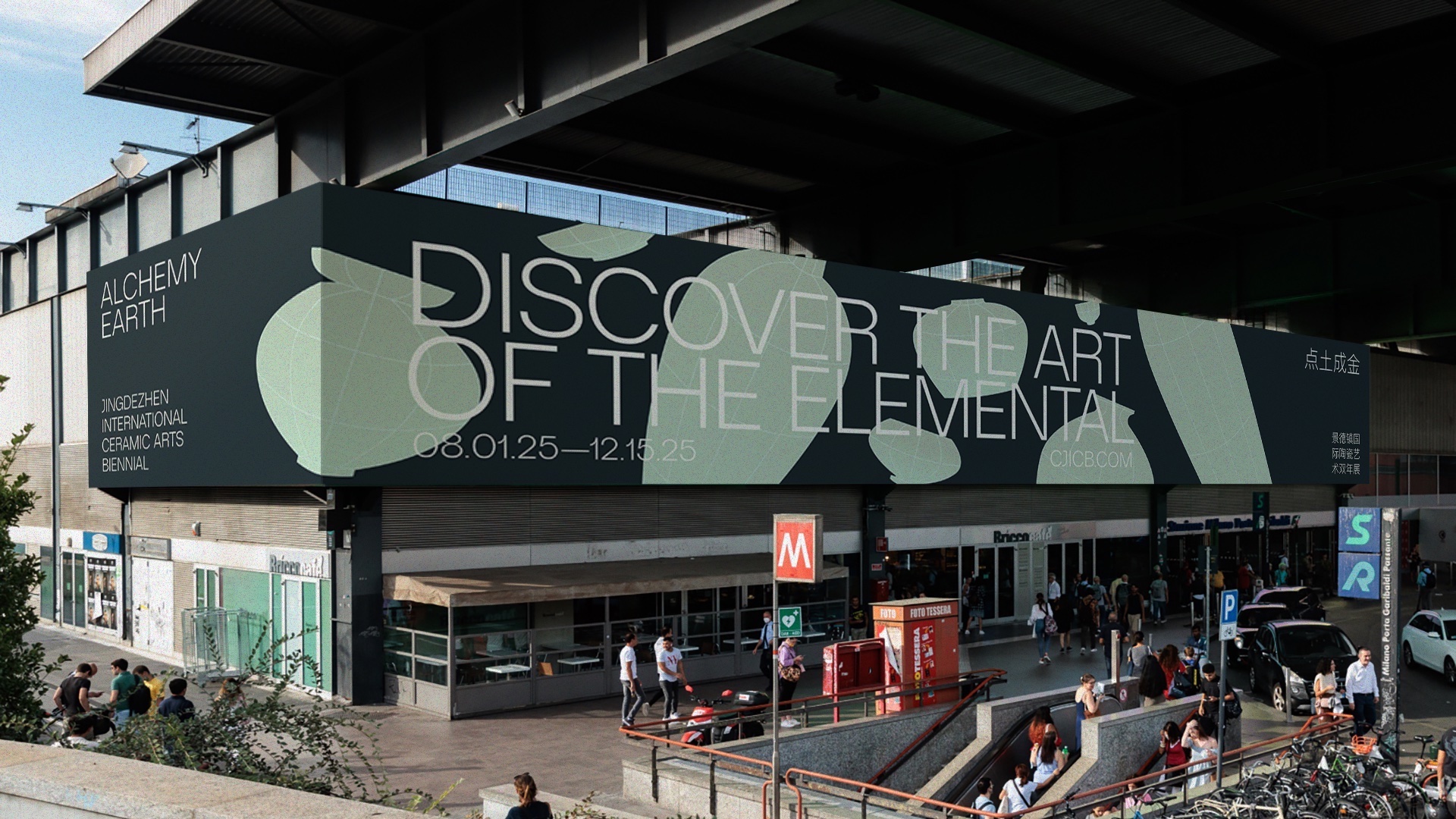
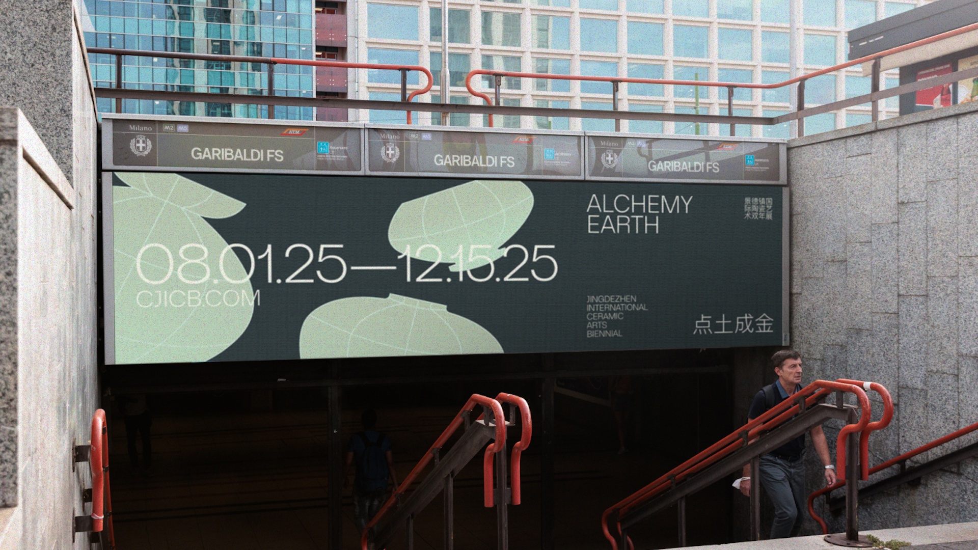
A modern, elegant identity for a ceramic arts biennial held in the birthplace of porcelain.
-
Skills
Identity Design
Brand Design
Motion Design
-
Duration
7 weeks
Spring 2024 -
Tools
Adobe Suite
Figma -
-
The Jingdezhen International Ceramic Arts Biennial is a celebration of the past, present, and future of the ceramic arts.
-
Held in the Jingdezhen Ceramic University, the Jingdezhen International Ceramic Arts Biennial is a source of local and national pride. Named the birthplace of porcelain, Jingdezhen is a culture hub for ceramicists across the globe. The third edition of the biennial celebrates the beauty of an ageless craft, of transforming elements into art, through what audiences across continents and time can only describe as alchemy.
-
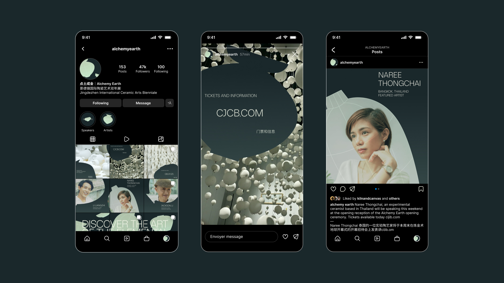
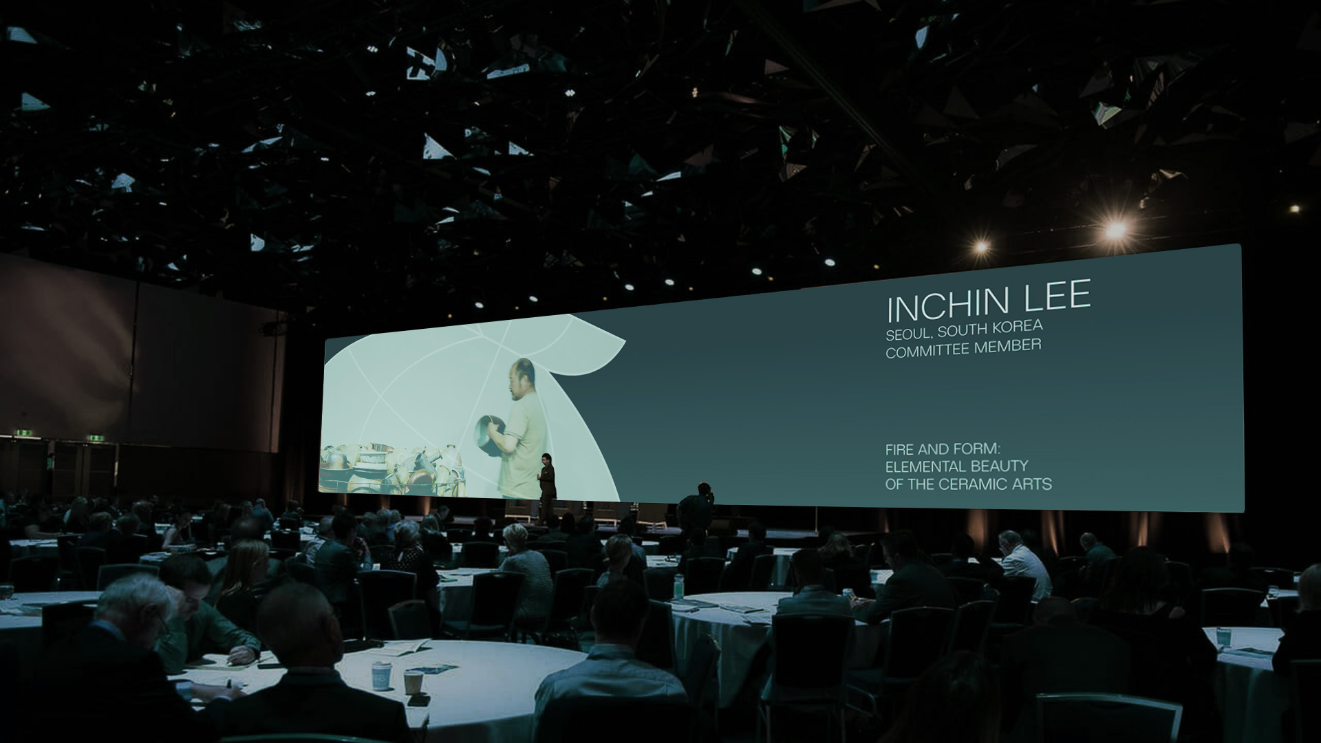
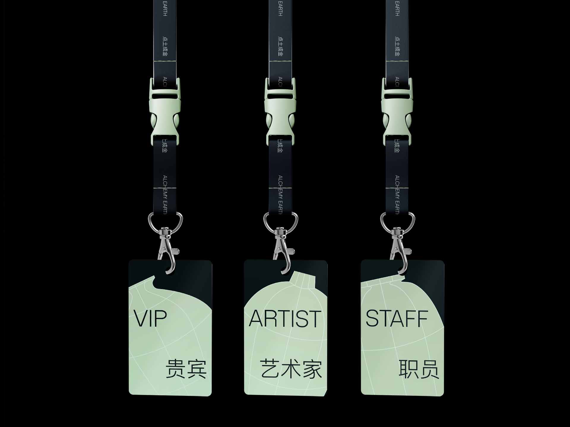
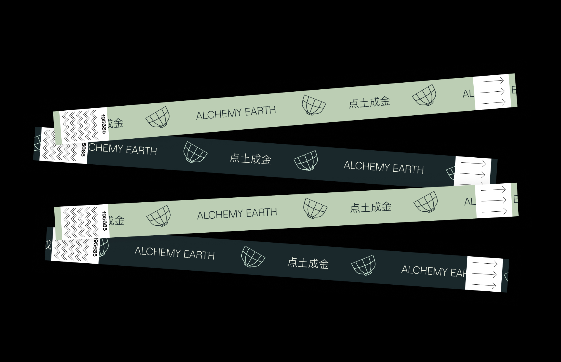
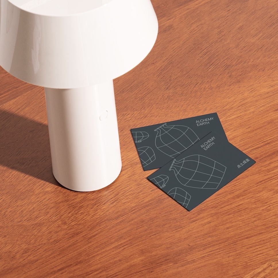
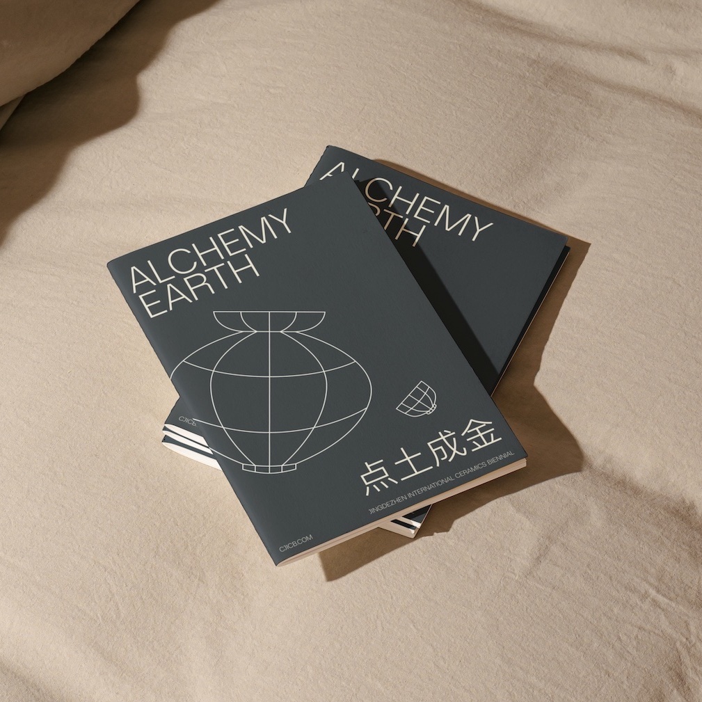
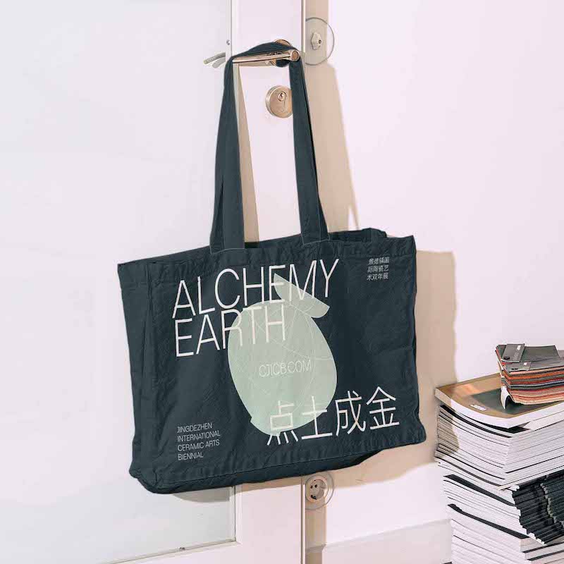
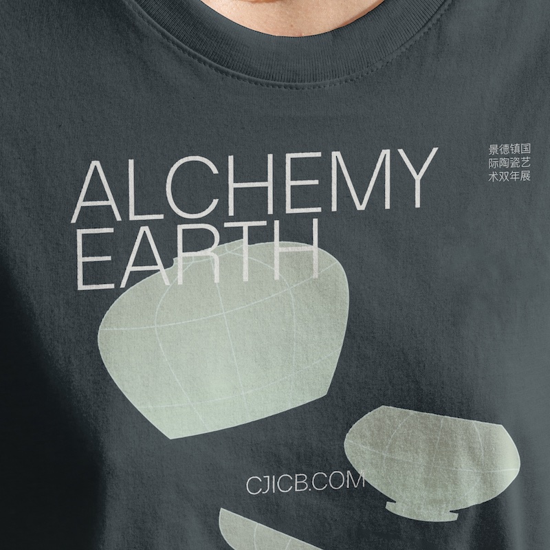
Collateral that is simultaneously trendy and minimal, appealing to students and goverment officials alike.
-
-
-
-
-
-
• Expanding
Building out systems for sustained usage
-
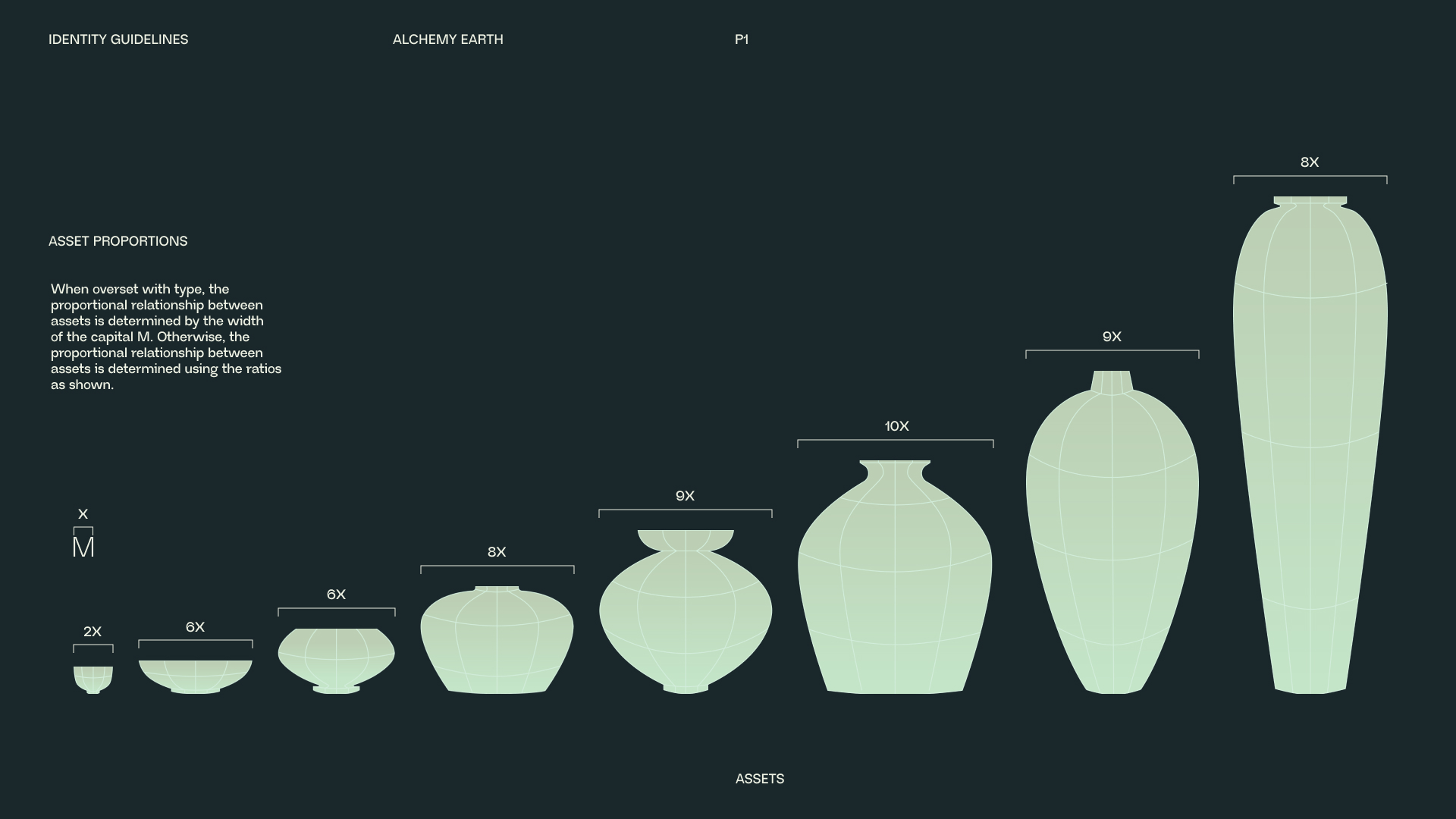
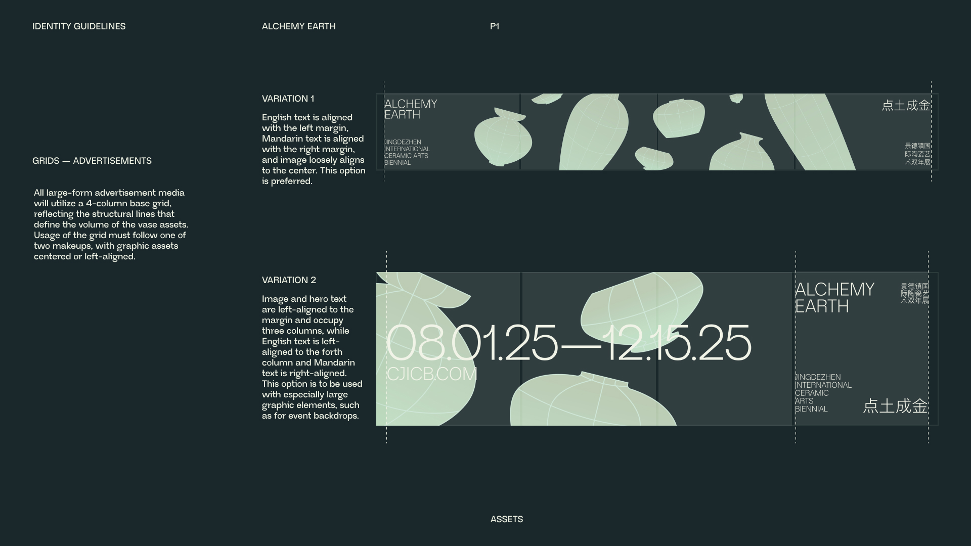
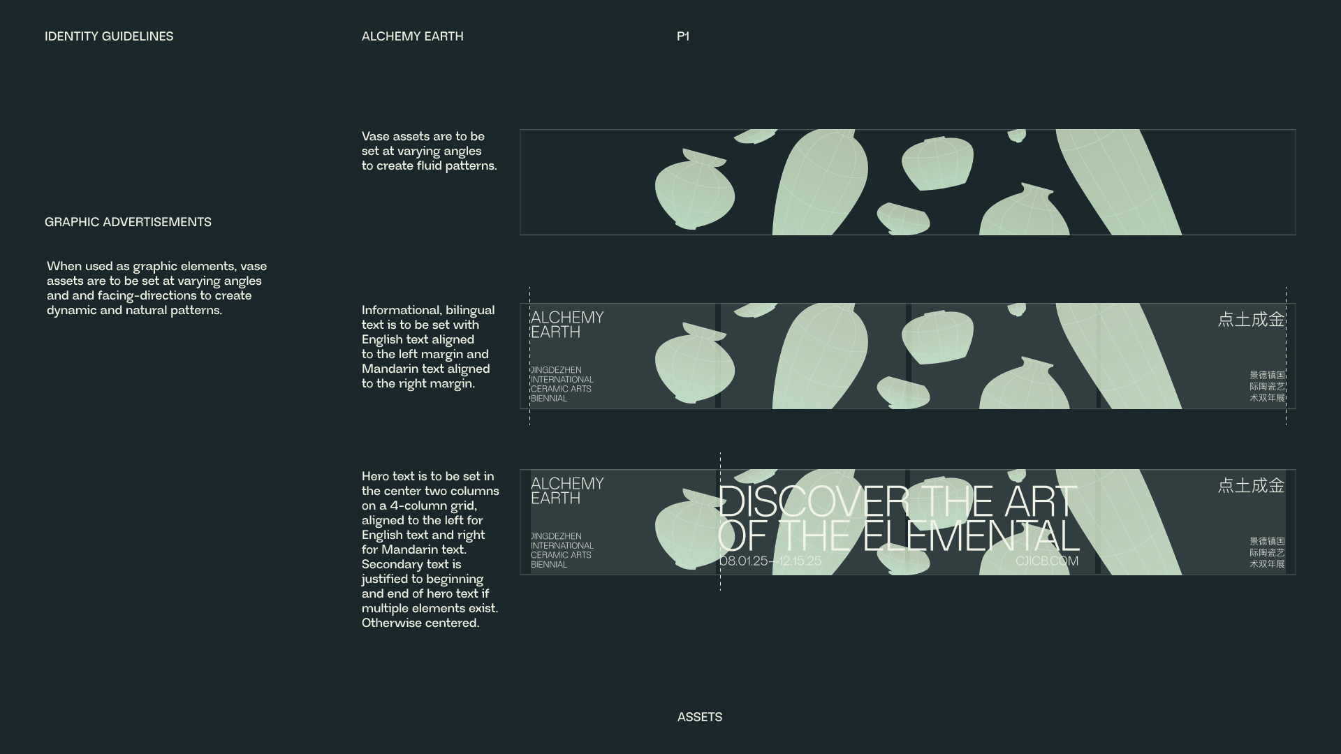
Defining guidance on how to replicate and reuse assets, with attention to how to properly document different usages of the grid to create a bilingual system in which scripts can exist individually or at the same moment.
-
-
The relationship between the two primary scripts is clearly defined for different mediums, laying groundwork for adapting the identity to different mediums while still allowing for flexibility for the designer.
-
• Ideation
Ideas that didn't make it.
-
A defining characteristic of the biennial was a celebration of the evolution of the ceramic arts from ancient Chinese empires to an international practice. The early ideation stages of this project were driven by a desire to capture the iconic nature of this art, through abstracting different concepts that continue to define ceramic arts in spite of the eons of change that have occured since the Ming Dynasty.
-

-

-

-

-
"Spin" was an exploration into the formation of clay into tangible three-dimensional form, .
-

-

-
"Tilt" was an abstraction of the 13° dragon kilns that the ancient Chinese craftsmen used to fire their pottery.
-

-

-
"Fracture" was an exploration into practice of destroying imperfect artifacts in the porcelain making-process, an homage to the obsessive journey towards perfection.
Ultimately in the decision-making process, I had to define elements of each path of exploration that I felt like would be appropriate to consolidate for a final identity system. The "Spin" idea is sexy but incompatible with Chinese, while the "Tilt" metaphor feels a little too removed from the biennial itself. "Fracture" has strength in its graphical nature, but the metaphor itself boredered on disrespectful.
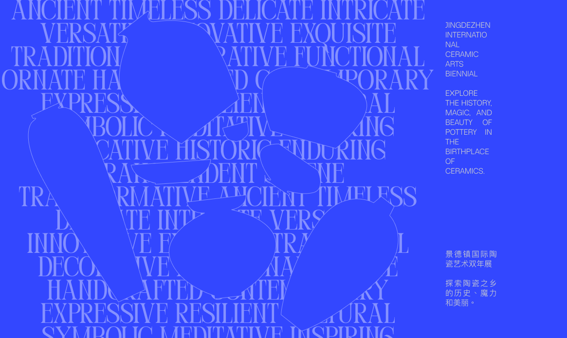
Through a careful assessment of my intention as the designer, I chose to combine more simplistic, representative ideas from the initial concepts, integrating clean typography and simple vase-shapes to create a very trendy, BLUE concept. -
-

-
The blue was intended on being a modern abstraction of the iconic Cobalt blue of Chinese porcelain, but it read as more technology-centered, trendy, agressively trendy, and flat. I drew inspiration from the "Spin" concept from earlier to reintroduce dimensionality into the assets, resulting in the assets created for the final.
-
• Next Steps
Web? Print? Oh boy!
-
This project is loosely on-going, and I have big plans on adapting the motion work done for the logotype to be translated into web format. Stay tuned I guess :>
-
